Line chart 2 – data from a column
Contents
Line chart 2 – data from a column#
This template is made for you to customize.#
If you want to work with a specific column in your data set, or maybe even several columns, here is a simple way to plot a line chart from a column. In this example we use a data set from here, which shows the number of near-Earth asteroids observed since 1900 and their size categories.
Go ahead and use this template if you want to make a line chart from a column of your data file (or you can use the example data set). You just have to replace the data set and variable names, and add some text. If you have any problems and you cannot find an answer from Google, please do contact us! We are happy to help you.
# Import libraries

import pandas as pd
import matplotlib.pyplot as plt
# Read csv file and skim it over, looks clean to me!

asteroids = pd.read_csv('https://raw.githubusercontent.com/opendata-education/Tyopajat/main/materiaali/data/near-earth-asteroids-discovered-over-time.csv')
asteroids.head()
| Entity | Code | Year | smaller_than_140m | between_140m_and_1km | larger_than_1km | |
|---|---|---|---|---|---|---|
| 0 | World | OWID_WRL | 1900 | 0 | 0 | 1 |
| 1 | World | OWID_WRL | 1910 | 0 | 0 | 1 |
| 2 | World | OWID_WRL | 1920 | 0 | 0 | 3 |
| 3 | World | OWID_WRL | 1930 | 0 | 0 | 5 |
| 4 | World | OWID_WRL | 1940 | 0 | 1 | 8 |
# Prepare the data for x-axis, in this case we take the values from 'Year' column into a variable 'years'
# Put the header of the column you want inside the square brackets

years = asteroids['Year']
print(years)
0     1900
1     1910
2     1920
3     1930
4     1940
5     1950
6     1960
7     1970
8     1980
9     1990
10    2000
11    2001
12    2002
13    2003
14    2004
15    2005
16    2006
17    2007
18    2008
19    2009
20    2010
21    2011
22    2012
23    2013
24    2014
25    2015
26    2016
27    2017
28    2018
29    2019
30    2020
31    2021
Name: Year, dtype: int64
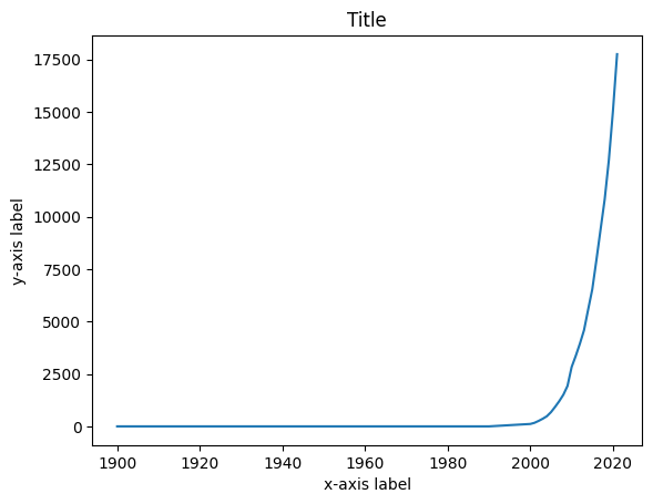
# Prepare the data for y-axis
# Let's pick the amount of small asteroids

small = asteroids['smaller_than_140m']
# Plot line chart with command plt.plot(x,y)

plt.plot(years, small)

plt.title('Title')
plt.xlabel('x-axis label')
plt.ylabel('y-axis label')

plt.show()
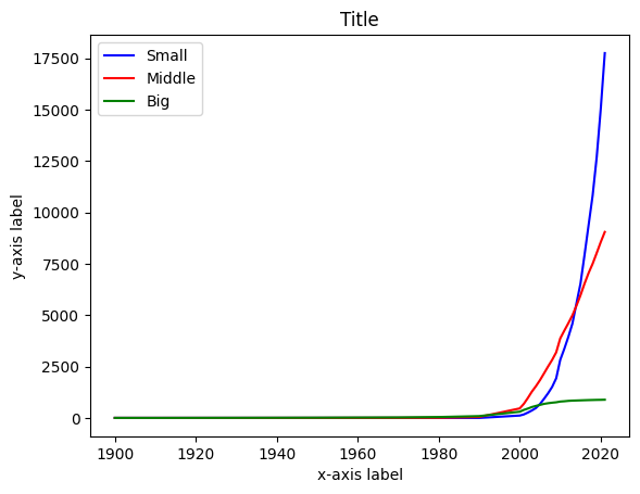
Plotting multiple lines in one graph#
# Prepare the rest of the data for y-axis, different lines to different variables

middle = asteroids['between_140m_and_1km']
big = asteroids['larger_than_1km']
# Plot all three lines, add colors and names for the lines

plt.plot(years, small, color='blue', label='Small')
plt.plot(years, middle, color='red', label='Middle')
plt.plot(years, big, color = 'green', label='Big')

plt.title('Title')
plt.xlabel('x-axis label')
plt.ylabel('y-axis label')

plt.legend() # Prints names for the lines
plt.show()
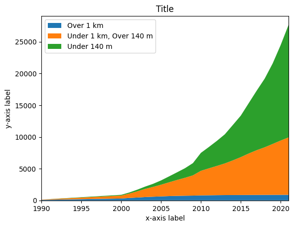
Plotting cumulative line chart#
Sometimes things are easier to visualize with a cumulative chart. It can be done with stackplot command from Matplotlib library.
fig, ax = plt.subplots() # You need this line if you want to have the cropping at the bottom line

plt.stackplot(years, big, middle, small, labels=['Over 1 km','Under 1 km, Over 140 m','Under 140 m'])
plt.legend(loc='upper left') # Forcing legend to show in the upper left corner

plt.title('Title')
plt.xlabel('x-axis label')
plt.ylabel('y-axis label')

ax.set_xlim(1990, 2021) # Cropping x-acis to show years 1990 - 2021
(1990.0, 2021.0)