Line chart 1 – data from a row
Contents
Line chart 1 – data from a row#
This template is made for you to customize.#
Sometimes we want to work with specific rows in a data set, especially when the data set appears to be in a list format. This type of data set is common when we are working on with objects that we can easily compare with each other, such as information between different countries, CO\(^2\) emissions of different food supplies etc. In this template we use a data set that can be found from here, showing country-specific energy consumption per capita from 1960 to 2015.
Go ahead and use this template if you want to make a line chart from a row of your data file (or you can use the example data set). You just have to replace the data set and variable names, and add some text. If you have any problems and you cannot find an answer from Google, please do contact us! We are happy to help you.
# Import libraries

import pandas as pd
import matplotlib.pyplot as plt
import numpy as np
# Read csv file, which is downloaded to GitHub.
# Head-command shows the data set, check that everything looks good.

energy_per_capita = pd.read_csv('https://raw.githubusercontent.com/opendata-education/Harjoittelu/main/data/energy_use_per_person.csv')
energy_per_capita.head()
| country | 1960 | 1961 | 1962 | 1963 | 1964 | 1965 | 1966 | 1967 | 1968 | ... | 2006 | 2007 | 2008 | 2009 | 2010 | 2011 | 2012 | 2013 | 2014 | 2015 | |
|---|---|---|---|---|---|---|---|---|---|---|---|---|---|---|---|---|---|---|---|---|---|
| 0 | Angola | NaN | NaN | NaN | NaN | NaN | NaN | NaN | NaN | NaN | ... | 459 | 472 | 492 | 515 | 521 | 522 | 552 | 534 | 545 | NaN |
| 1 | Albania | NaN | NaN | NaN | NaN | NaN | NaN | NaN | NaN | NaN | ... | 707 | 680 | 711 | 732 | 729 | 765 | 688 | 801 | 808 | NaN |
| 2 | United Arab Emirates | NaN | NaN | NaN | NaN | NaN | NaN | NaN | NaN | NaN | ... | 8720 | 8130 | 8370 | 7570 | 7220 | 7190 | 7480 | 7600 | 7650 | NaN |
| 3 | Argentina | NaN | NaN | NaN | NaN | NaN | NaN | NaN | NaN | NaN | ... | 1850 | 1860 | 1940 | 1870 | 1930 | 1950 | 1940 | 1970 | 2030 | NaN |
| 4 | Armenia | NaN | NaN | NaN | NaN | NaN | NaN | NaN | NaN | NaN | ... | 865 | 973 | 1030 | 904 | 863 | 944 | 1030 | 1000 | 1020 | NaN |
5 rows × 57 columns
# With this command we can check the row of the wanted country, so we can use that information later.

energy_per_capita.loc[energy_per_capita['country'] == 'Finland']
| country | 1960 | 1961 | 1962 | 1963 | 1964 | 1965 | 1966 | 1967 | 1968 | ... | 2006 | 2007 | 2008 | 2009 | 2010 | 2011 | 2012 | 2013 | 2014 | 2015 | |
|---|---|---|---|---|---|---|---|---|---|---|---|---|---|---|---|---|---|---|---|---|---|
| 51 | Finland | 2200 | 2250 | 2360 | 2480 | 2680 | 2890 | 3070 | 3130 | 3340 | ... | 7110 | 6970 | 6670 | 6270 | 6830 | 6540 | 6280 | 6120 | 6210 | 5920 |
1 rows × 57 columns
# Prepare the data for x-axis - collect the column headers into a list
# Use np.int_ or np.float_ commands. This changes the objects in the list to values
# It is working, if it removes these '' from around the values

# The number in square brackets in .values[1:] meand that we are choosing columns from nr. 1 till the last one
# First column is nr. 0, so this drops off the 'country' column.
# If you'd like to choose years 1960-1969, the command would be .values[1:11].

year = list(np.int_(energy_per_capita.columns.values[1:]))
print(year)
[1960, 1961, 1962, 1963, 1964, 1965, 1966, 1967, 1968, 1969, 1970, 1971, 1972, 1973, 1974, 1975, 1976, 1977, 1978, 1979, 1980, 1981, 1982, 1983, 1984, 1985, 1986, 1987, 1988, 1989, 1990, 1991, 1992, 1993, 1994, 1995, 1996, 1997, 1998, 1999, 2000, 2001, 2002, 2003, 2004, 2005, 2006, 2007, 2008, 2009, 2010, 2011, 2012, 2013, 2014, 2015]
# Prepare the data for y-axis.
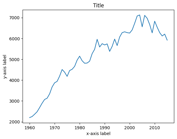
# Insert the number of the row you are interested in into the square brackets, for Finland it is 51.
finland = energy_per_capita.loc[51]
finland = list(np.int_(finland[1:]))
print(finland)
[2200, 2250, 2360, 2480, 2680, 2890, 3070, 3130, 3340, 3670, 3870, 3940, 4190, 4510, 4380, 4180, 4460, 4520, 4660, 4960, 5150, 4930, 4810, 4820, 4910, 5270, 5480, 5960, 5590, 5750, 5690, 5740, 5380, 5620, 5970, 5660, 6070, 6280, 6320, 6280, 6260, 6410, 6730, 7080, 7130, 6560, 7110, 6970, 6670, 6270, 6830, 6540, 6280, 6120, 6210, 5920]
# All the data has been prepared, so we can create the plot with plt.plot(x,y) command

plt.plot(year, finland)
plt.title('Title')
plt.xlabel('x-axis label')
plt.ylabel('y-axis label')
plt.show()
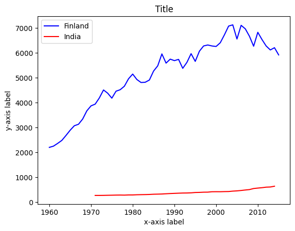
If you want to add another line into the chart, here is the code:#
Let’s compare the energy consumption between Finns and Indians.
# Finding India from the data set.

energy_per_capita.loc[energy_per_capita['country'] == 'India']
| country | 1960 | 1961 | 1962 | 1963 | 1964 | 1965 | 1966 | 1967 | 1968 | ... | 2006 | 2007 | 2008 | 2009 | 2010 | 2011 | 2012 | 2013 | 2014 | 2015 | |
|---|---|---|---|---|---|---|---|---|---|---|---|---|---|---|---|---|---|---|---|---|---|
| 72 | India | NaN | NaN | NaN | NaN | NaN | NaN | NaN | NaN | NaN | ... | 466 | 485 | 502 | 545 | 562 | 578 | 599 | 606 | 637 | NaN |
1 rows × 57 columns
# Prepare the second data for y-axis, in this case both have the same x-axis.

india = energy_per_capita.loc[72]
india = list(np.float_(india[1:]))
print(india)
[nan, nan, nan, nan, nan, nan, nan, nan, nan, nan, nan, 267.0, 267.0, 269.0, 273.0, 276.0, 280.0, 282.0, 279.0, 286.0, 286.0, 294.0, 298.0, 301.0, 306.0, 315.0, 319.0, 324.0, 334.0, 343.0, 350.0, 357.0, 363.0, 365.0, 371.0, 385.0, 389.0, 397.0, 399.0, 415.0, 417.0, 416.0, 421.0, 424.0, 440.0, 450.0, 466.0, 485.0, 502.0, 545.0, 562.0, 578.0, 599.0, 606.0, 637.0, nan]
# Plotting both lines, adding colors and names for the lines.

plt.plot(year, finland, color='blue', label='Finland')
plt.plot(year, india, color='red', label='India')

plt.title('Title')
plt.xlabel('x-axis label')
plt.ylabel('y-axis label')

plt.legend() # Prints names of the lines
plt.show()